
The case for classic design
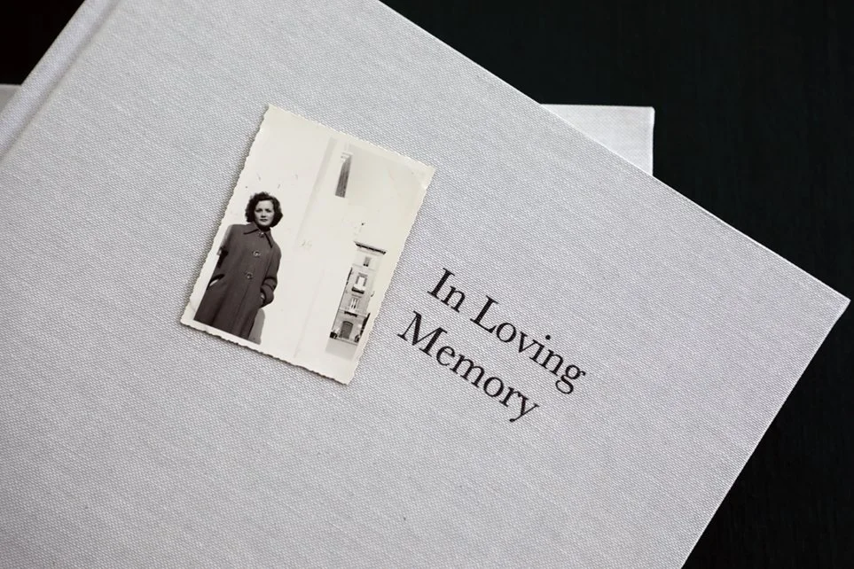
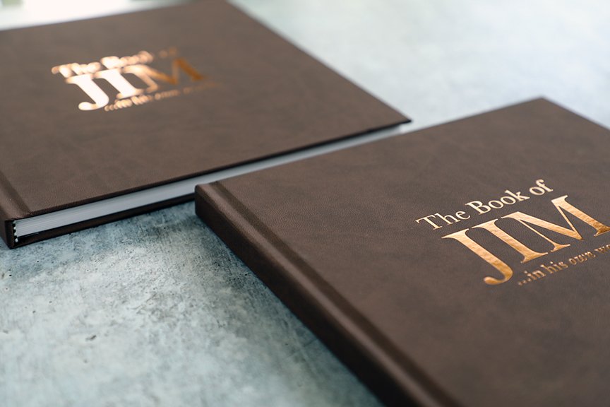
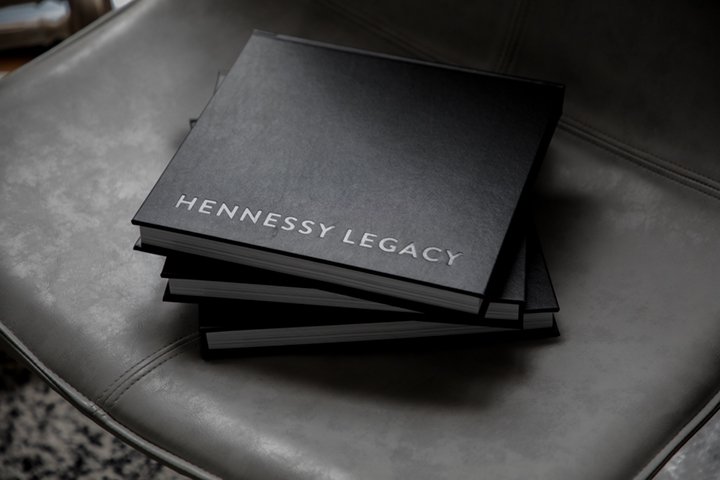
Black leather and a debossed title elevate this book cover from boring to elegant, signaling the timeless page design inside.
I have a pair of Adidas Spezial sneakers that I purchased in the 1980s and still wear today. Adidas debuted the style in 1979, and it’s sold in an array of colorways as part of the Originals line on their website in 2025.
I have an Armani tailored black blazer that I bought in the late 1990s that I still wear today. Its materials and craftsmanship were worth the hundreds of dollars I invested in the piece when I worked at Vogue, and no one would guess it wasn’t brand new now.
My fashion sense has always tended towards fine classics (often embellished with bolder accessories that I can swap out as the times change). “Classic,” in the way I view it, is a synonym for “timeless.”
And “classic, timeless style” is an aesthetic I also apply to the heirloom books I create for my clients.
You won’t find trendy design approaches or typeface choices that broadcast a specific decade (unless that’s befitting the stories within, of course!) at Modern Heirloom Books. Instead, we’ll work together to find a design that feels right to the client and their stories, while also respecting tradition and legibility—so your book feels fresh and of its time, no matter when your descendants are reading it.
Why I opt for classic book design
Have you ever picked up a book and known it was old despite its pristine condition? Your grandparents’ wedding album, perhaps (pillowy white leather with gold italic imprinting, say)? Or a softcover book that’s been sitting on your shelf for decades (Are You There God? It’s Me, Margaret comes to mind for me, with its instantly recognizable cover treatments across different editions)?
Design, like fashion, can date itself. This isn’t necessarily a bad thing—retro aesthetics have their place; but for life story books, I aim for something more enduring. A book that captures your legacy should not feel like a product of a fleeting trend. It should be designed with longevity in mind, so it remains engaging and accessible for future generations.
“Designers choose typefaces by considering the history of type, the combinations of form, the balance between readability and surprise, the content and themes at hand, and the designer’s own desires and interests,” Ellen Lupton explains in Thinking with Type.
The two variables sandwiched in the middle of that sentence are of the utmost importance to me when designing an heirloom book:
Finding “the balance between readability and surprise.”
Serving “the content and themes at hand.”
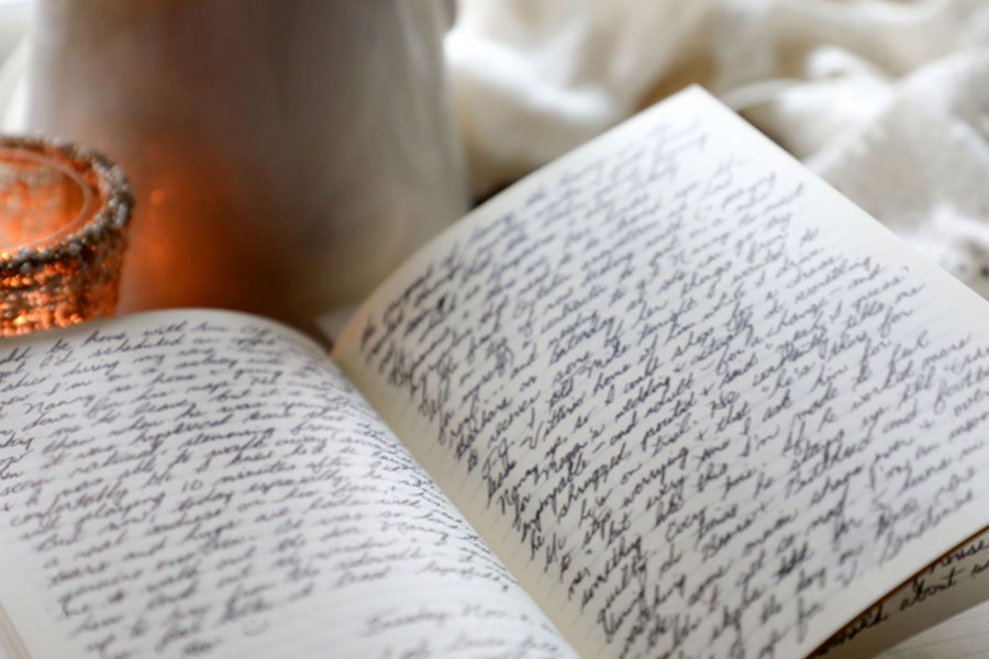
Ample white space gives a life story book breathing room.
The Balance Between Readability and Surprise
Readability should always take precedence in book design, particularly for long-form personal narratives. A typeface that prioritizes elegance over clarity—one with too much flair, too little contrast, or an overly condensed structure—becomes a distraction rather than an enhancement.
This is why many classic books use time-honored typefaces such as Garamond, Baskerville, or Times New Roman. These fonts have endured for centuries because they provide that perfect harmony: sophisticated yet unintrusive, distinctive yet universally readable.
Surprise, however, is where personality comes in. This might be through subtle flourishes—a well-placed drop cap, a unique yet restrained display font for chapter titles, a slightly unexpected but still harmonious color palette. These are touches that make a book feel special without overpowering the narrative itself.
Serving the Content and Themes at Hand
A book about a family’s multigenerational journey deserves a design that reflects continuity. A memoir detailing a life of adventure may benefit from visual storytelling elements like maps or archival-style captions. The key is ensuring that every design choice serves the story rather than pulling attention away from it.
Elements such as generous margins, high-quality paper, and a well-proportioned layout all contribute to a book’s readability and aesthetic longevity. White space, for example, isn’t just about making a page look elegant—it allows the reader’s eyes to rest, giving weight to the words and photographs that matter most.
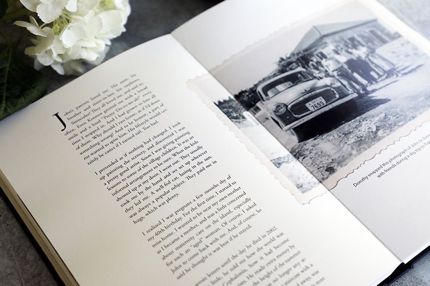
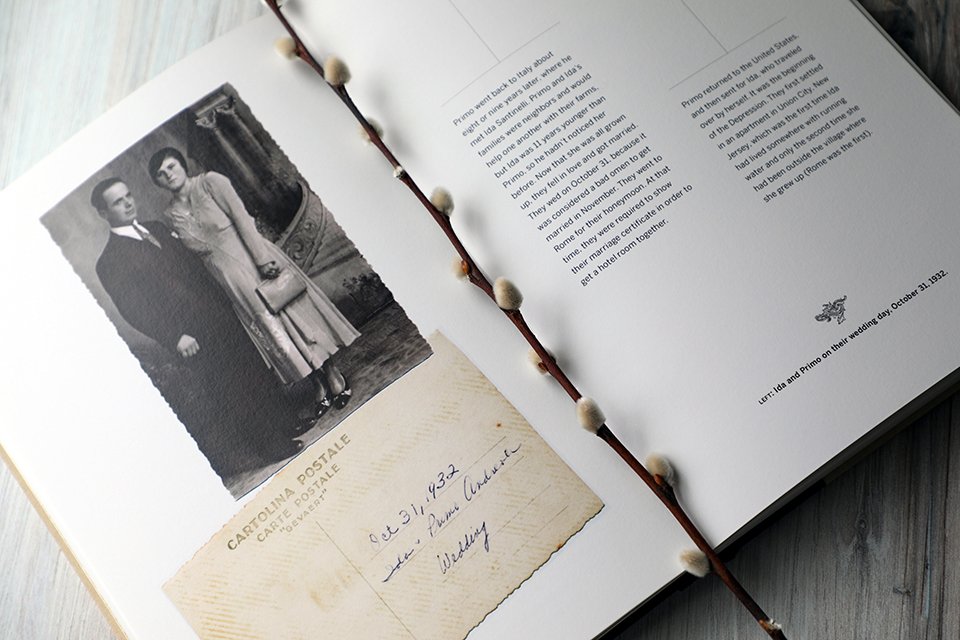
This book of correspondence between a father and his daughter during her time at Georgetown University used Adobe Caslon, the same font in the Georgetown logo, for display type; Caslon was originally designed in 1722, and its modern iterations are still revered for its readability and elegance.
What makes a timeless book design?
There are a few fundamental principles that contribute to classic, enduring book design:
Typography with integrity: Typefaces that have stood the test of time, with an emphasis on readability and subtle beauty.
Thoughtful layouts: Balanced margins, considered line spacing, and harmonious text hierarchy to create an effortless reading experience.
Understated elegance: A design that enhances the story without distracting from it, avoiding overly trendy or gimmicky elements.
Quality materials: A book’s physical form is part of its longevity—fine archival paper, durable binding, and careful printing methods ensure that it lasts as an heirloom.
When you commission a personal history book, you are investing in something that will outlive you—a physical manifestation of your legacy. The stories within are timeless, and the design should reflect that. A well-designed book will not only be read; it will become a treasured heirloom, passed down and revisited for generations.


A book that captures your legacy should be designed with longevity in mind, so it remains engaging and accessible for generations. It should be beautiful, too.